Glenmorangie
Glenmorangie Reset
- Brand Strategy & Design
- Identity Design
- Packaging Design
The single malt Scotch category was booming, but Glenmorangie was just one of the ‘Glens’, inconsistent and indistinctive. We saw a way to make them one-of-a-kind.

THE CHALLENGE
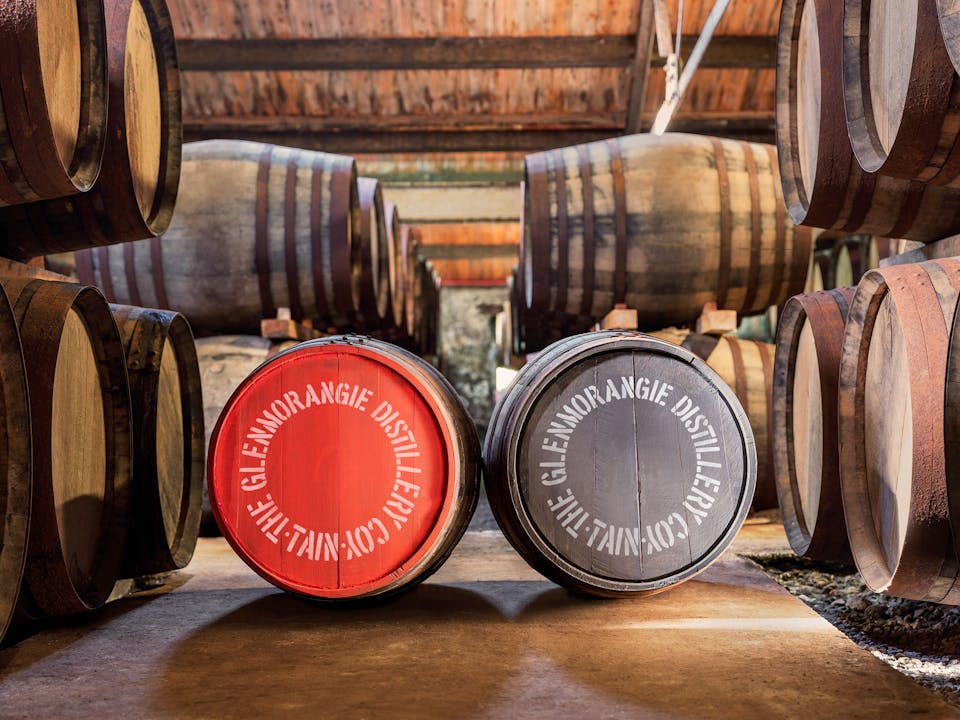
Glenmorangie has been dreaming up wondrous whiskies since 1843. But while time was doing wonders for its golden liquid, it had dulled the lustre of a great brand identity with layers of ‘old whisky’ texture and iconography. With a renewed brand strategy we were tasked with rebranding and reinvigorating the range. A modernised pack and brand design with one eye on their rich heritage was the brief. Demonstrating to new audiences that Glenmorangie was more than just another ‘Glen’, the goal.
OUR APPROACH
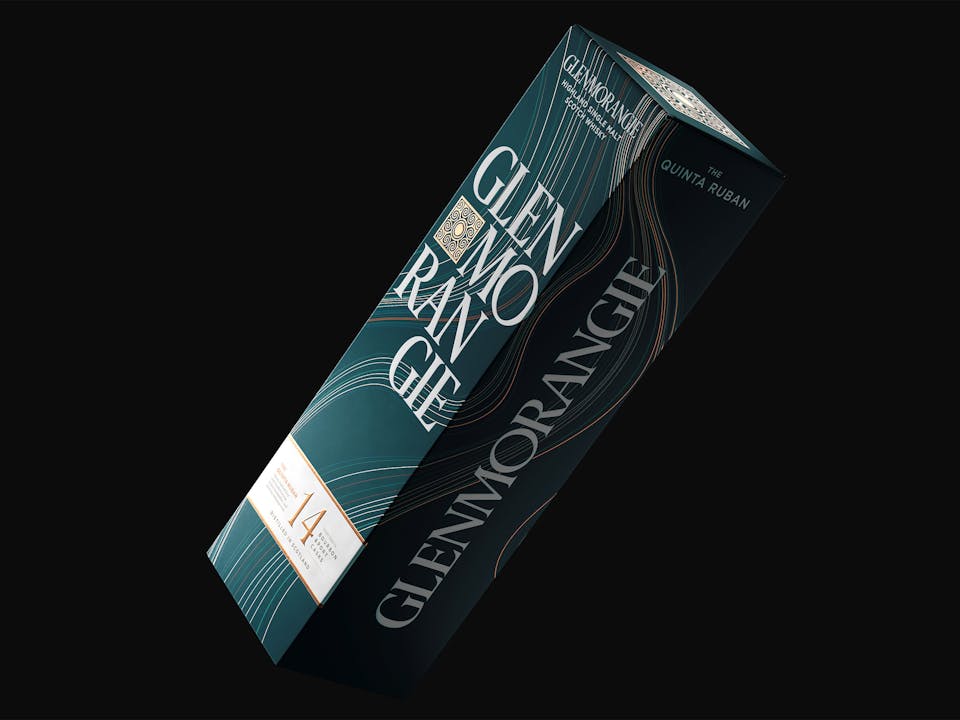
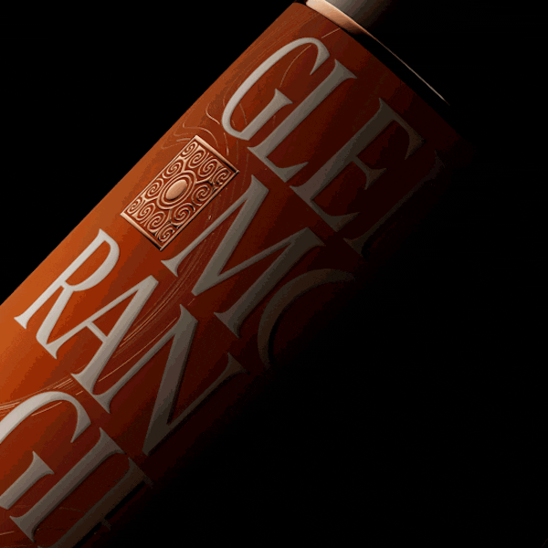
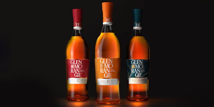
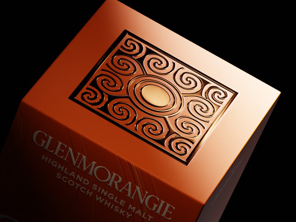
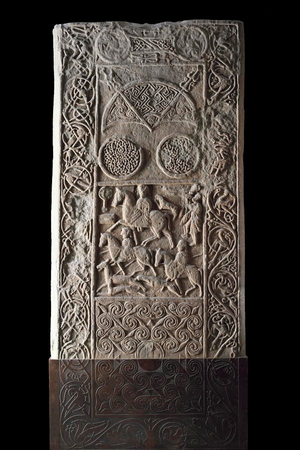
Glenmorangie’s bottle already had a lot going for it. Standing tall and curvaceous in a typically masculine and geometric arena, all it needed was a slight refinement to bring its silhouette up to date. On the punt, we embossed a swirling ‘eddie’ to ground our design in Glenmorangie’s storied past. Adapted from their famous Signet Emblem, it remembers the Cadboll Stone relic recovered near the site of the distillery. After paying dues to the brand cornerstone, we rebuilt the iconic wordmark in a bold and eye-catching style. Playfully stacked to maximise standout on the narrow packaging format, it speaks to a new generation of malt drinkers unencumbered by old whisky codes.

THE COLOUR OF WONDER
We saw that embracing a more optimistic, joyful and sensory relationship with colour would be key to delivering Glenmorangie’s ambition. Going deep on the theory, we arrived at a standout hue that would help light a fire under the new brand. With a new orange setting the tone, we set about refreshing the variants with more confident on-pack colourways. Wondrous line art, representing layered flavour notes and the grain of finishing casks, was incorporated to enhance the visual appeal and give the outer packaging an unboxing edge.

THE RESULT
We created delicious packaging that not only cued flavour and craft, but reinforced the enduring sense of wonder underpinning the Glenmorangie brand. Ownable and in tune with the new brand positioning and motto: ‘It’s kind of delicious and wonderful’, our visual identity for the core range helped bring the global refresh to life. Not just on pack but at retail, informing the design treatment for product displays, pop-up store environments and architecture.