3x TAKEAWAYS FROM A WEIRD WORLD CUP
We’re already deep into the most bizarre, most controversial, most scrutinised and possibly the most despicable sporting event of all time. Nothing about the 2022 FIFA World Cup in Qatar has seemed right, from the host nation’s dubious human rights record to the disorientating winter schedule. Even England winning their opening game 6-2 was a bit weird.
The subdued build-up suggested brands were unsure how to navigate the issues swirling around the tournament. But a major boycott among fans failed to materialise and the global TV audience is estimated to reach up to five billion. Most of us with moral misgivings are watching the action regardless, and the World Cup remains a bumper once-every-four-years opportunity that advertisers are unwilling to miss.
Here we look at how brands have approached an unprecedented edition of this great sporting showpiece, and what we can learn from four strange weeks in the Persian Gulf.
1. WE STILL GET A KICK FROM BIG FOOTBALL ADS
Millennial football fans go dewy-eyed at the mere mention of classic World Cup ads like Nike’s Joga Bonito. In recent years, a formulaic approach – typically, superstar players engaged in an epic, effects-laden football battle – has dulled their appeal.
However, this World Cup has seen top sports brands return to form. Despite the negativity and uncertainty around the tournament, we were treated to a clutch of big-budget spots that created genuine buzz around the world’s best players going head-to-head.
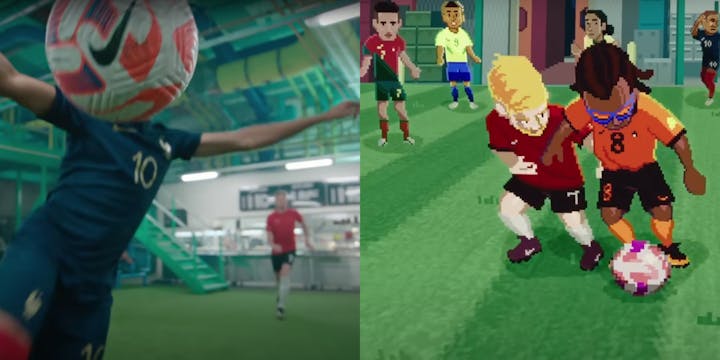
Image: Nike
Family Reunion from Adidas assembles big names like Lionel Messi and Karim Benzema (plus the ubiquitous Stormzy) for a stylish, nostalgic spot that surely shares creative DNA with the brand’s recent Gucci collab. Nike’s Footballverse is a typically overblown effort, but it seems to embrace the silliness (and gently skewer the inherent daftness of the metaverse?) with zany scientists creating a fantasy game between past and present stars.
Perennial underdog Puma also gets on the score sheet with Fearless, an energetic spot featuring Brazilian talisman Neymar Jr and a group of “FOTs” (football obsessed teens). The one thing missing from each ad is overt references to Qatar – the desert scene closing out the Adidas spot is the closest visual link to the host nation.
2. SUBVERTING CELEBRATION MAKES AN IMPACT
The likes of Nike and Adidas are expected to make the most of the World Cup, but organisations with a less obvious connection can also use the event to grab a share of attention.
Perhaps the most powerful work related to this tournament comes from Women’s Aid, who partnered with artist Corbin Shaw to highlight the rise in domestic abuse during major sporting events. Placing a simple yet startling twist on a slogan that forms part of our national football identity, He’s Coming Home is a sinister 60 seconds you won’t quickly forget.
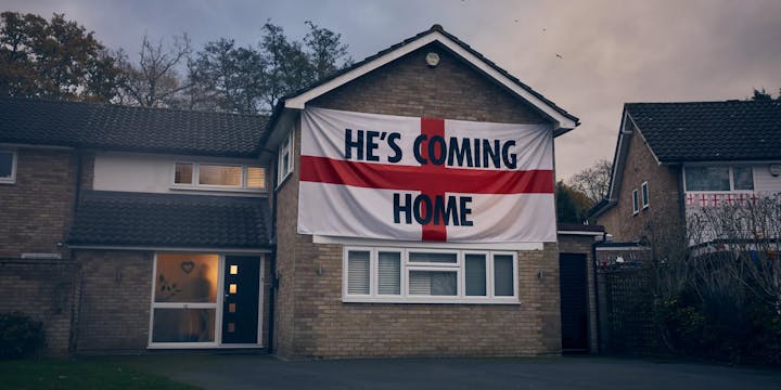
Image: Women's Aid
Launched on the International Day for the Elimination of Violence Against Women (November 25th), the spot was developed to raise awareness of how domestic violence typically increases during the winter months – and when England play football.
Creative director on the project Christopher Ringsell commented: “We want to subvert the usual football tropes and shine a light on the chilling fact that for many women it’s a time of fear, not celebration.”
3. FOOTBALL KITS STILL MEAN A LOT
Few icons of popular culture carry the rich symbolism and emotional charge of the football shirt. In Brazil, the national team’s famous yellow jersey became a political flashpoint heading into the World Cup, with fans trying to reclaim the kit from recent associations with Jair Bolsonaro’s far-right government. In Qatar, where the anti-discrimination OneLove armband was effectively outlawed by FIFA just before the tournament began, what players wear on the pitch seems under greater scrutiny than ever before.
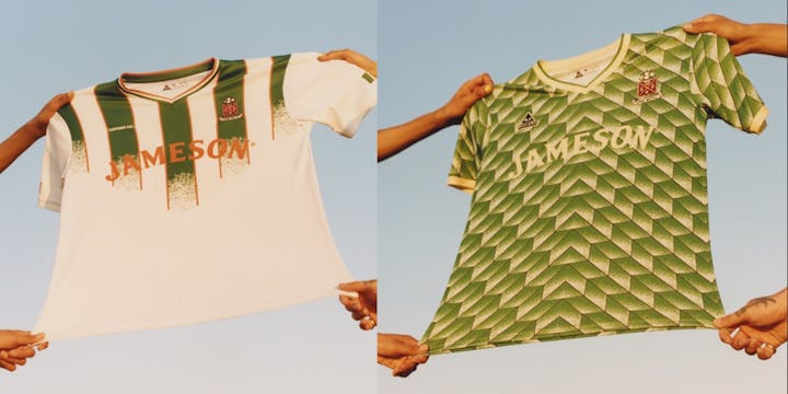
Image: Jameson
Hummel found a way to make a statement with its World Cup kit for Denmark, creating a “toned down” version of the red jersey that reduces the prominence of both the Danish badge and its own logo. The brand also designed an all-black third kit to represent “the colour of mourning”. Hummel said: “We wish to make a statement about Qatar's human rights record and its treatment of the migrant workers that have built the country's World Cup stadiums. We believe that sport should bring people together.”
By toning things down, Hummel managed greater standout. This move seems to achieve the double-positive of making a progressive statement and being a savvy step for the brand, which must punch above its weight to compete with Nike and the rest.
Away from Qatar, another brand showing an understanding of the football shirt’s rare cultural power is Jameson. The whiskey collaborated with football-inspired streetwear label Lovers FC for a World Cup-adjacent capsule of reimagined national team jerseys, putting a fresh twist on retro classics from the likes of Brazil, Argentina and of course, Ireland.
Words by Matt Duxbury, Senior Copywriter.
SEEN is our monthly-ish 3x3 newsletter about brands, trends and creativity. Subscribe by getting in touch here: hello@lovecreative.com.