SOL
A FRESH START FOR SOL
- Brand Strategy & Design
- Identity Design
- Packaging Design
- Comms

SOL was failing to catch the eye of younger consumers. Despite having a global pull, lack of distinction meant the brand had fallen into the shadow of other category giants. Through a new identity and packaging, we broadcasted SOL’s brightness, unleashing a brand refresh that felt exactly that: refreshing.

THE CHALLENGE
Originally created in 1899, SOL was once a craft pioneer. A true heritage beer brand, they had long championed their impressive history across packs – including cues around Mexican provenance and nods to their sun namesake.
Over time however, this extraordinary heritage had become diluted, making it difficult for SOL to shine in today’s overcrowded beer market. We were challenged with bringing the brand back into the light and showing SOL the way to a brighter future.

THE ARCHIVE
Starting our journey by digging through the brand’s archives, we uncovered a treasure trove of labels, faded signage and campaigns full of intricate detail begging to be brought back into the light.

Enlisting the help of illustrator Tobias Hall, we began to craft many of these heritage cues into new brand assets – reimagining SOL’s historic brand marks and typography with a modern edge.

BRAND ASSETS
Out of this, we created an iconic new wordmark, restored from the beautifully idiosyncratic lettering of historic labels, as well as bespoke supporting type which also reflects the brand’s origins through a mix of fonts reminiscent of ornate archive bottles.


PACKAGING
On pack, we gave life to the brand’s namesake, elevating the SOL sun with deeper storytelling. No longer a functional background asset, the sun shows its full face for the first time, gazing toward a bright future – now redrawn as a radiant heritage symbol.

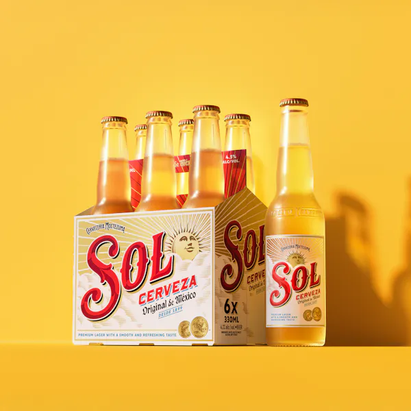


A vibrant colour palette dials up SOL’s iconic red and gold, while introducing a fresh teal to represent a crisp, clear blue sky. Full of life and energy, it now more effectively reflects a brand that was born from a culture synonymous with bold, vibrant colour. An illustration of the Paris Exposition gold medal won by the brand in the early 1900s was also fine-tuned to heighten its significance on pack.

The future-proof system also stretches beyond the Original core range to span multiple formats, including SOL Zero, SOL Cheladas and SOL Mix.


TO THE FUTURE
Going beyond pack, the new identity is part of a fully realised brand world that can evolve with changing consumer expectations. As part of this journey, we also crafted a detailed brand book, which touched on all aspects of the redesign – including a bold and sunny new tone of voice which could be carried across pack and into wider comms.


Every touchpoint radiates the same energy as the sun that inspired it. A refreshed identity that feels bold, warm, and unmistakably alive.