Botanic Lab
- Brand Strategy & Design
- Identity Design
- Packaging Design

Botanic Lab needed an identity to reflect their disruptive nature and proudly progressive values. We saw the chance to create a personality-led drinks brand that leaps off the shelf.
THE CHALLENGE
Botanic Lab’s original identity and packaging established the brand as a health drink innovator, but its laboratory aesthetic and understated personality lacked punch. It didn’t reflect the owner’s rebellious streak and desire to disrupt the category. Botanic Lab needed a brand identity that lived up to its progressive outlook.
OUR RESPONSE
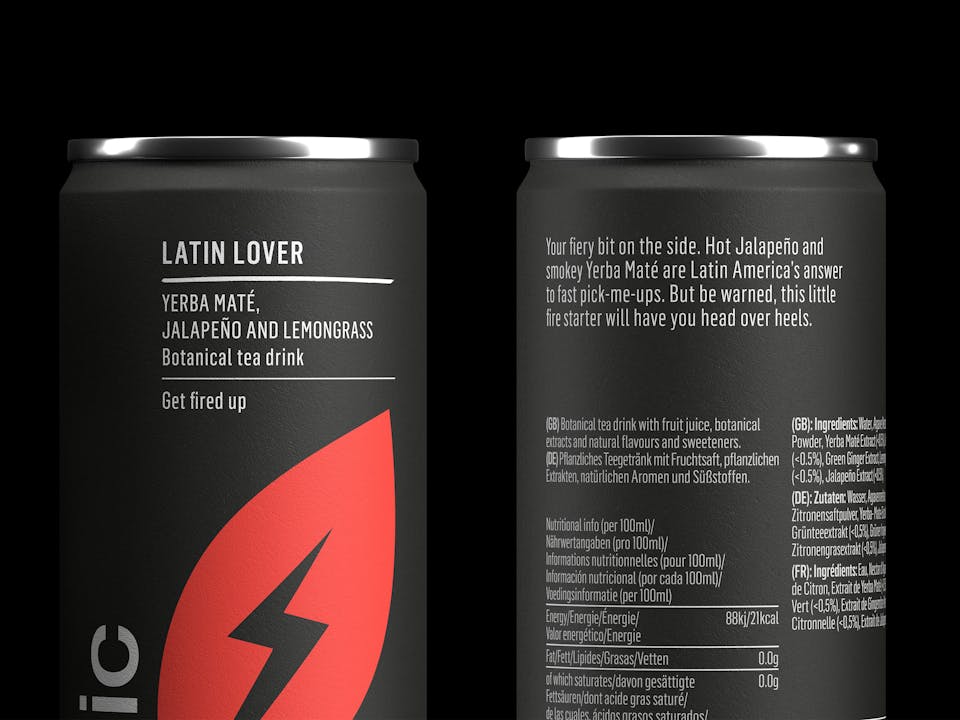
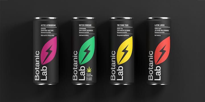
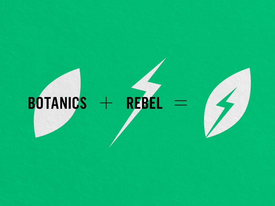
We turned Botanic Lab black. Repositioning around the rebel archetype, we introduced a boldly irreverent tone of voice and created a new identity shot through with a bolt of rebellion.
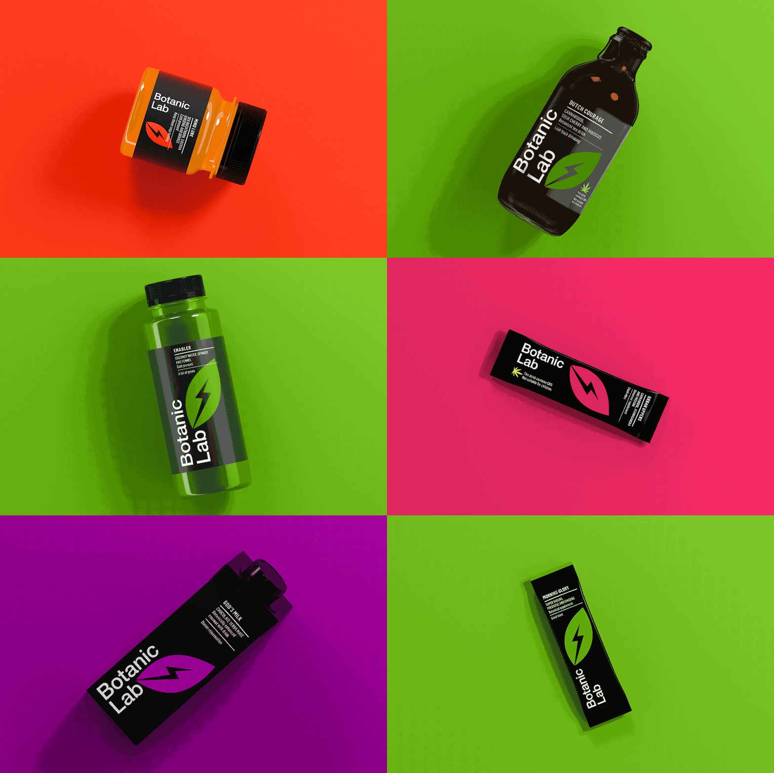
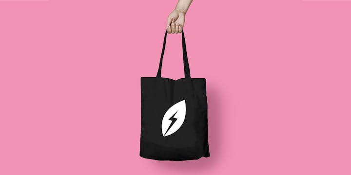
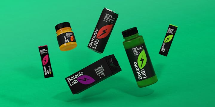
Inspired by the brand’s defiantly progressive take on the category, we created a new symbol: the lightning leaf. This aids recognition across the full portfolio, with colour variation used to differentiate flavours, product benefits and product lines.
Tone of voice
For a brand with so much to say, we couldn’t stop at a simple packaging overhaul. The new design language demands that the industry sit up and take notice, and we wanted Botanic Lab’s voice to do the same.
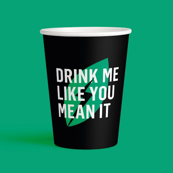
Designed to be provocative on and off pack, the tone of voice uses wit and personality to set Botanic Lab apart as a straight-talking challenger, unafraid to cause a stir and have some fun. We used every inch of packaging real estate to amplify the brand voice. There are too many over-serious health brands out there, and we had no intention of creating another. These drinks are about pleasure, after all.
