HÄAGEN-DAZS
HÄAGEN-DAZS LIMITED-EDITION
- Identity Design
- Packaging Design
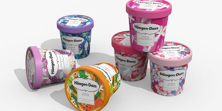
When Häagen-Dazs decided to launch a range of limited-edition flavours, we saw an opportunity to deliver some truly one-off packaging.
THE CHALLENGE
The Häagen-Dazs audience is highly active on Instagram, so the brand needed a way to connect with people and stand out in this space. We know modern consumers love extra-special experiences they can share on social media. It was time to introduce limited editions to the Häagen-Dazs portfolio.
OUR RESPONSE
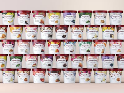
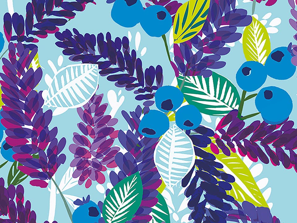
We had already introduced illustrative patterns to all Häagen-Dazs packs as part of the global rebrand. They function as a vibrant and colourful product navigation aid and represent not just the ice cream flavour, but where it takes you. When it came to creating the limited-edition range, we decided to take these flavour patterns to the next level.
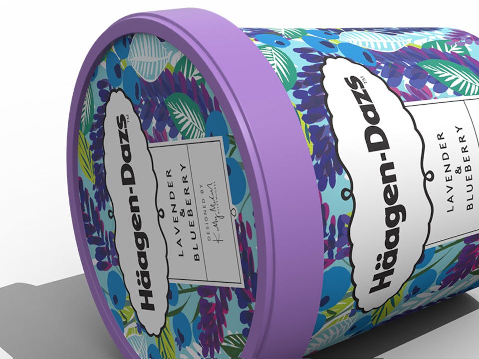
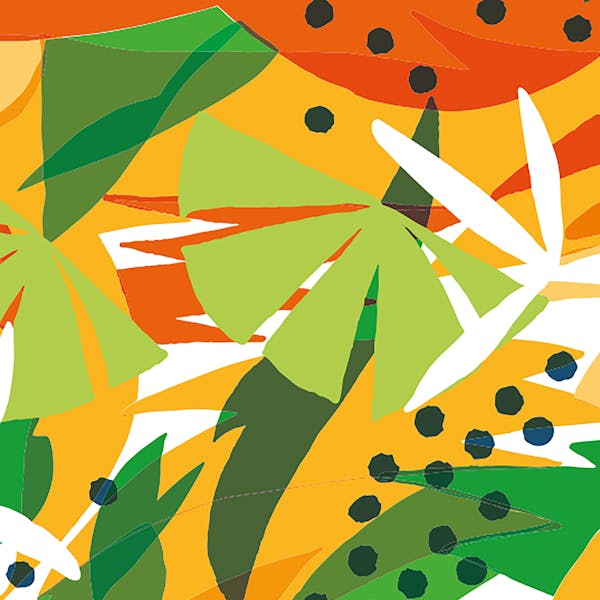
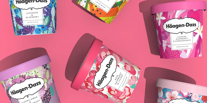
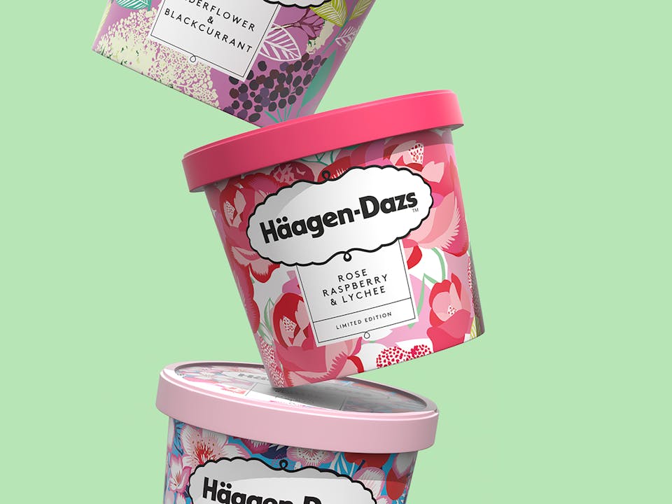
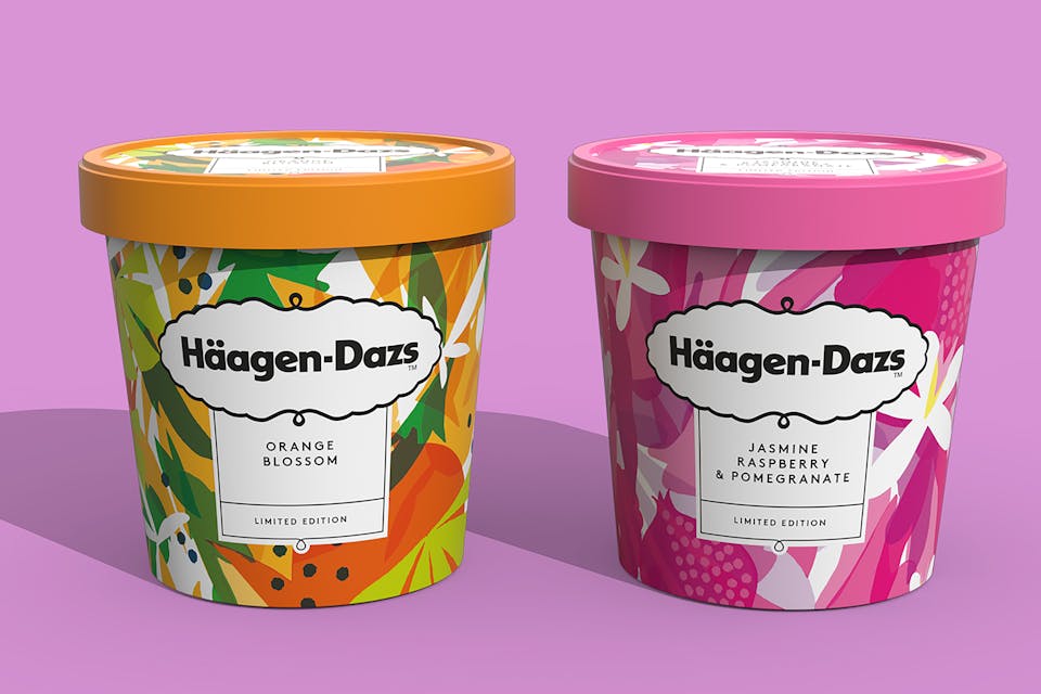
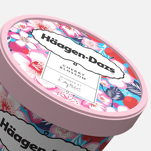
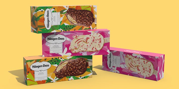
SAY IT WITH FLOWERS
We collaborated with artists Kitty McCall and Eddie Perrote to bring these limited-edition floral flavours to life, expanding the pattern across the entire packaging for maximum stand-out.
The powerful use of illustration communicates the exotic flavour combinations, shows off their extraordinary ingredients and takes Häagen-Dazs into a more contemporary space with attention-grabbing power, on-shelf and on Instagram.